Global Navigation Redesign: Telstra ICM
- shant safarian
- Jun 14, 2024
- 3 min read
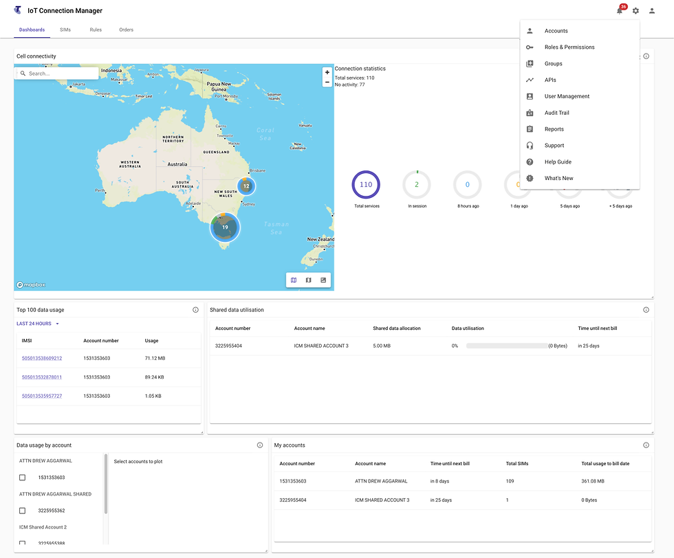
The ICM platform by Telstra is designed to help businesses manage and optimize their Internet of Things (IoT) solutions effectively. It offers comprehensive management of IoT devices, SIM cards, and connectivity, providing a dashboard for real-time monitoring, device management, data collection, and analytics. ICM supports a large number of connected SIMs, with significant deployments like the one with Yarra Valley Water, which involves one million IoT services and millions of devices across Australia.
Project Background
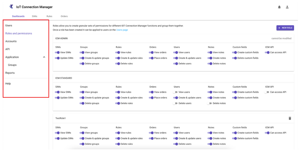
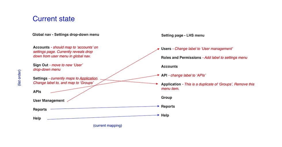
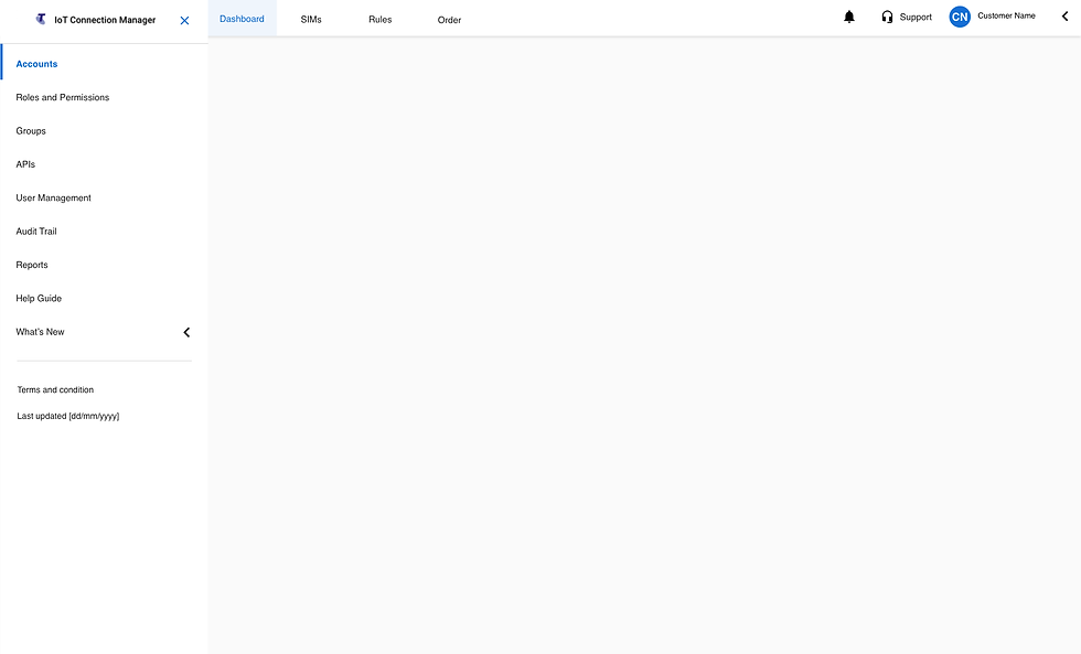
The navigation in the ICM platform was initially divided into three sections: the global navigation positioned at the top of the application, a drop-down menu located in the top right-hand corner represented by a cog icon, and menu drawers that were only visible after interacting with items in the drop-down menu.
Problem Definition
The existing navigation system was disjointed and difficult to use. One of the major issues was that there was no way to access the menu drawers via the global navigation. The drop-down menu was represented by a cog icon, universally recognized as a settings symbol, which added to the confusion since it did not intuitively indicate that it was a menu. Additionally, users could only access the menu drawers by clicking on items in the drop-down menu, and these drawers contained links critical to user navigation deeper in the application.
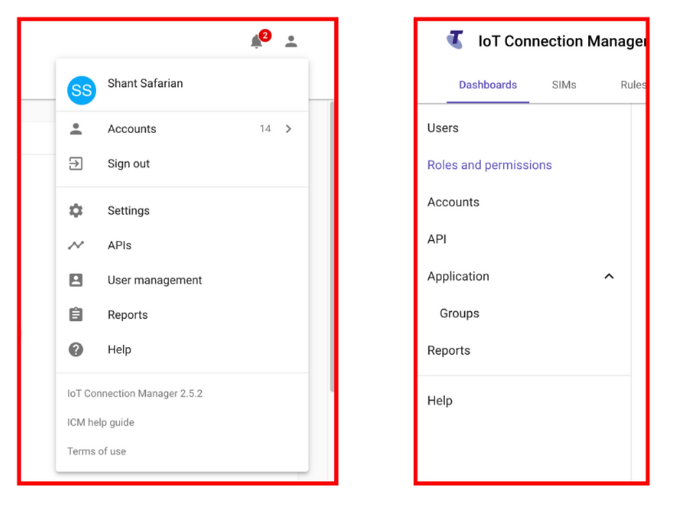
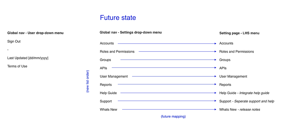
Moreover, there were inconsistencies between the links in the drop-down menu and the navigation drawers. These inconsistencies included incorrect mapping of links, inconsistent labeling (taxonomy), incorrect order of links, poor hierarchy and grouping of similar elements, missing links from the drop-down menu, and duplicate menu links.
Solution - Phase 1
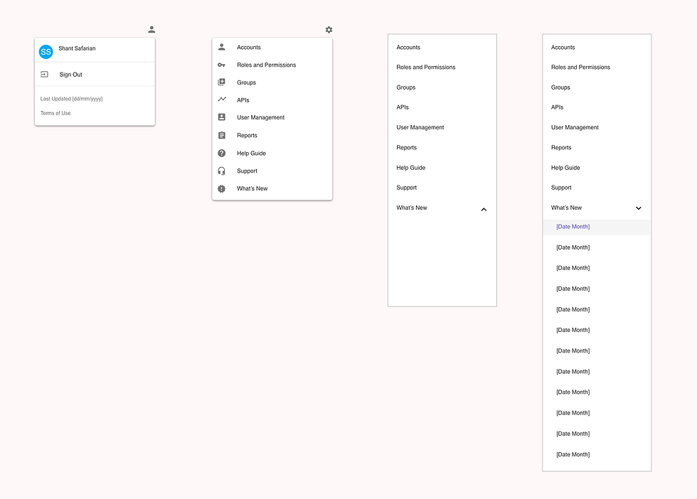
The first phase of the solution focused on immediate improvements to the existing navigation system. We started by fixing the taxonomy to ensure consistent and clear labeling across all navigation elements. Next, we reorganized the links into logical groupings to improve findability and added any missing links that were necessary for comprehensive navigation. Duplicate links were removed to streamline the user experience. Additionally, a new user icon was introduced in the global navigation, featuring links to Profile, Sign Out, Last Update Date, and Terms of Use.
Solution - Phase 2
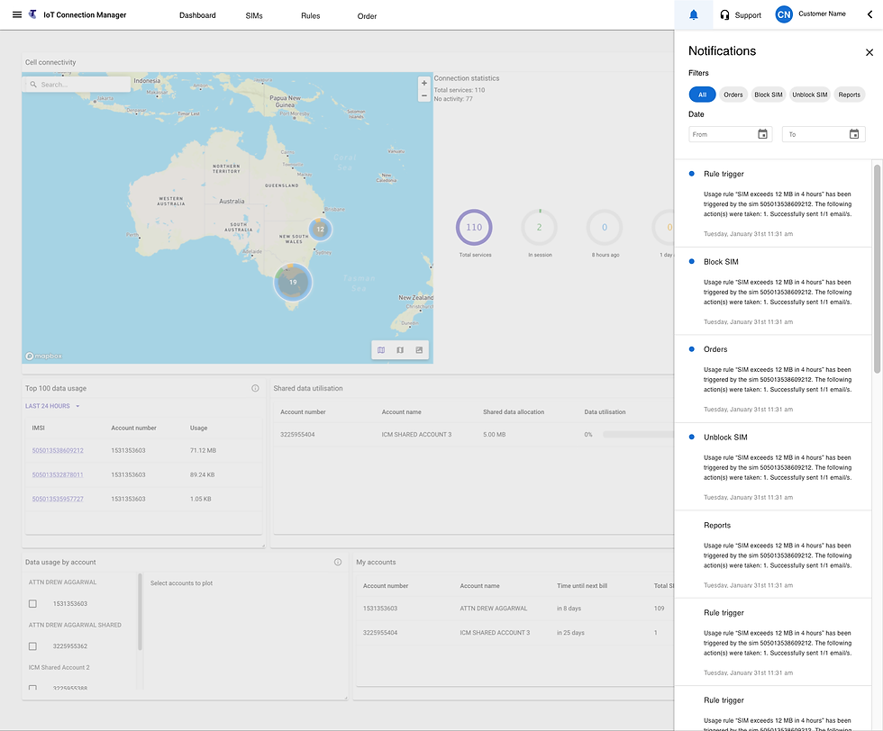
The second phase involved a comprehensive redesign of the global navigation. We updated the menu drawers to an accordion style, making them accessible via a hamburger icon located in the top left-hand corner of the global navigation. This redesign incorporated the updates from Phase 1, including the fixed taxonomy, reorganized links, and the new user icon.
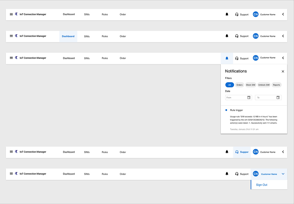
During Phase 2 of the redesign, I also redesigned the notification drop-down and the filter functionality to further align ICM with T-Connect, a single sign-on application that businesses use to access applications such as ICM and others. It was important for the UI to align with T-Connect as the two interfaces must feel and function in the same way to improve the user experience and avoid user confusion.
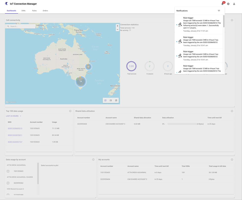
Current state
Future state
Benefits of Improved Navigation
The redesigned navigation significantly reduced cognitive load by organizing information in a logical manner, making it easier for users to find what they needed. Consistent labeling and grouping improved users' ability to recognize and navigate through the platform. Clear navigation reduced users' reliance on memory, leading to fewer errors and less friction.
Overall, these improvements led to an enhanced user experience by making the ICM platform more intuitive and user-friendly.
Increasing ROI of UX
A well-designed navigation system drives customer satisfaction, loyalty, and retention. The ease of use resulting from the navigation redesign enhances the credibility of the ICM platform, resulting in a higher return on investment for UX improvements.
Conclusion
By addressing the navigation issues in the ICM platform, we have significantly improved the user experience. The redesigned navigation is more intuitive, consistent, and user-friendly, enhancing overall usability and satisfaction. This case study showcases the importance of a well-organized information architecture in driving user engagement and satisfaction in complex platforms like IoT Connection Manager.
Comments